29th September 2010
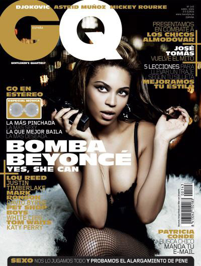
In this blog I went onto the internet to look at real life magazines to see what devices they use and to learn the layout of it. One example of a magazine I looked at was GQ magazine.  With this magazine the title is big and bold and so it stands out. Secondly the colors of gold and white which is also in the title are prominent everywhere. For instance at the sub headings are in gold. What you can also see is that the rest of the text is small when in compared to the title.
Most importantly the picture of Beyonce is clear to see and is in the background, this means that the text doesn't get in the way. What I learnt from this is that the image and the text all have to blend in with each other like in this magazine gold, white, and black all intertwine and that it shouldnt look jimbled up and muddled.
Now lets compare the previous magazine to something more like a tabloid.  Here the title stands out because it's in red. However the sub-heading "Cheryl" is bigger than the actual title. What I took from this is that I wouldn’t want the sub headings to be overbearing because it makes things to chaotic.
28th september 2010
In my media lesson I had to create a front cover template and present it to the class. First one of the students in my class had already creating a frony page. So me and my class analysed his work to see what was good about it and what was bad. His design was light blue and black. However I criticised it because I thought the colours were dark and not appealing. So I suggested that he change the colour to something more vibrant like red for example, because red s a colour which will strike people, and because our target audience is sixth formers this is very important.
Some of the positives of his work was that the title was good. It was called "life". Another positive was that his title was bigger than the rest of the text. This is a very important feature magazines and it was good that he implemented it.
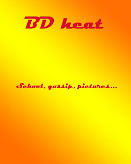
Afterwards I had to start work on my own front cover and here is a quick tmeplate of what is looks like now
 Although very basic now, throughout the course of the next couple of days I will add considreble more detail.
27th September 2010
Today I was given a sheet with details on how to complete my coursework. The sheet gave me information on when our deadline was and what was expected from the examiners. In my second lesson of the day I went on fronter to look of A* examples of coursework for me to look at to get an idea on how our coursework is ideally meant to look.
But first I had to prioritise my preliminary task. In my preliminary task I would have to create a school magazine with an appropriate front page, and I also have to create a contents page. With this in mind I decided to carry out some research. So firstly I had to make up some names for my future magazine. It took me a considreble amount of time until finally I had 4 titles. They were Jimba magazine, BD heat, sixth form times, and simply the school magazine. Each title had it’s pros and cons. Jimba magazine sounded random and weird, but at the same time it was exiting and different. BD heat, my favourite, was good because it would grab people’s attention immediately aswell as it sounded fun. 6th form times sounded to official and boring so I was sceptical. Finally my last title was school magazine, it was short and precise, and also the students would immediately know what the magazine is likely to contain.
Here are my results from asking students in sixth form to vote on a title for my magazine
Jimba magazine-8
BD heat- 16
Sixth form times 2
School magazine-1
The title I predicted most likely to win came out on top. But I was also glad that it was universally popular with most of the peers. Also because of the success of my research I decided that I would try and ask the students more things to do with the magazine In my next blog I will be do more research in what real life magazines are like and whether I can extract new ideas from them.


