Here is my first draft of my front page spread. Firslty I have included a small image of my music artist DJ dexter, and have put it in black and white just like the image on my contents page of my artist. I've done this so that the contents page and the double page spread are linked together. I have been conventional with my double page spread because I have done it in a Q&A format which means the I ask my artist a question and they respond. Also I used the same colours that were used on the contents page and the front page, red, white, and black.
Tuesday, 30 November 2010
Friday, 26 November 2010
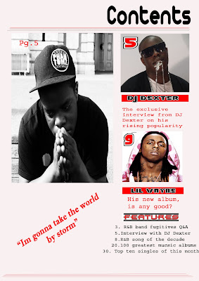
Here is the first draft for my front cover, and as you can see its still a work in progress and it does seem a bit empty without a lot of content. I tried to make the layout very simple in order for it not to look to cluttered. I have put one of the images in black and white intentionality because I feel that when my reader see's it he will realise that the tone of the article might be serious. I have then put the other images in there real colour which indicates that those articles might not be as in depth, and also it might mean its more light hearted. I have added features on the bottom to make it more conventional as in music magazines they often include features that show the reader what things that that magazine will contain that is special to that particular magazine.
I tried to make my mode of address appropriate for example it says " his new album, is it any good". I've done this to entice my reader as it will make them want to see whether or not Lil Wayne's album is actually any good. For some improvements I will add more pictures. Also I will try to add a competition advert somewhere. Then where the quotation is of my main article I intend to put it onto the actual image. And finally I want to alter the layout to make it look, well...better.
Tuesday, 23 November 2010
2nd draft of my front cover
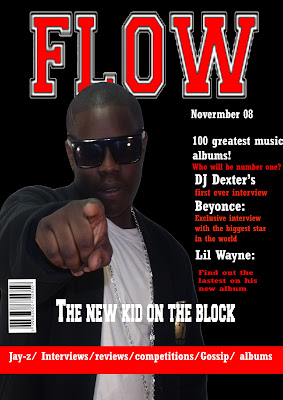
Here's the second draft of my front cover. The big difference between my previous front cover is that I have changed the colour of the background. I did this because I thought that red was a bit overbearing, and I also thought that black would suit my front cover best. So I decided to have a vote involving the people in in my class I up 6 people participated. 3 people said that they prefer the red background, and another 3 said that they like the black cover instead. What was most interesting was the the 3 people who voted for the red background were all female, and the people who voted for the black background were all male. What this shows is the because red could be seen as a feminine colour and it generally has female connotations females are more attracted by this colour. And black is more neutral so therefore you could argue that males would be more attracted to it. And considering the fact that my I have identified my ideal as a male I took the decision to keep the black in order to attract the reader I want.
Thursday, 18 November 2010
First draft
Here's the first draft for the front cover of my magazine for the main task of my media studies coursework. The first thing I did was decide upon the colour of my background. I decided to use red because I thought red would look best with the gold text theme i wanted to use. I also added a lighting affect so that its if there is a light shinning on him.
Another thing I worked on for the front cover was my mode of address. I tried to entice my target audience. So for example on the front cover I said " Beyonce reveals all" I deliberately tried to get the reader thinking, what she could be about to reveal instead of actually telling them she has to say, as a result my reader is more likely to look inside at the content page.
The position on my artist on the magazine is at the side because i thought it would work well with the text being on the side, and with my artist pointing directly at the reader. However I still wondering whether this is a good idea or whether I should change it.
Tuesday, 16 November 2010
Photos
Here are some of the images that I have taken for the front of magazine:
This iamge I took of my artist pointing at the camera becuase I wanted it to stirke the reader, and also it comes across as arrogant. Which I wanted. One of the the problems with this shot was that my teacher said that the artists hands is to big, however I disapproved because I like the image a lot. Another prolbem is that you can see the top of the background. But this can easily be cropped out.

ANother one of my images that I liked was this one becuase the lighting is quite good and therefore I won't have to edit as much afterwards. Also it makes him seem modest, but of course stil arrogant at the same time.

This iamge I took of my artist pointing at the camera becuase I wanted it to stirke the reader, and also it comes across as arrogant. Which I wanted. One of the the problems with this shot was that my teacher said that the artists hands is to big, however I disapproved because I like the image a lot. Another prolbem is that you can see the top of the background. But this can easily be cropped out.

ANother one of my images that I liked was this one becuase the lighting is quite good and therefore I won't have to edit as much afterwards. Also it makes him seem modest, but of course stil arrogant at the same time.
Monday, 15 November 2010
Media homework
The gratification theory apply's to the typical reader of my music magazine because my magazine will have certain media conventions that I can use to appeal to my ideal reader. For example on my double page spread of my magazine I can include an advertisement of a album. Also in my magazine article I will ask my music artist questions that talk about his latest album. This is an example of the gratification theory because my ideal reader could use this information and discuss it with friends etc.. Additionally this creates a sense of belonging because the reader will feel like there in the know, and that they have the latest info on there favourite music. My magazine will also contain entertainment through competitions that will be advertised on the front cover and this acts as a way of making the magazine sort of connect with my ideal reader, moreover it acts as a form of escapism because the reader knows that if they win the competition that they will be reward. Another reason my magazine promotes escapism is that my music article will give them an insight into the music and entertainment world.
On of the articles I read in the Classic Rock magazine was a double page spread where various musicians commented on a music producer with each musician praising him. For example one person said. "Jimmy was very innovation. Also he was very thorough, he knew what he wanted". This might appeal the the magazines target audience and ideal reader because they are likely to have a an in depth knowledge of who these musicians are, and will probably be very intrigued and interested to see what these musicians views are on a particular subject. On the next page which is also a double page spread they continue to interview people about the producer, but on this page they advertise the latest albums, this I think has been used to grab the readers attention as the article is quite long and they could be board, but at the same time classic rock's target audience is of a much older demographic and therefore you could argue that they aren't actually beginning to get board.
On of the articles I read in the Classic Rock magazine was a double page spread where various musicians commented on a music producer with each musician praising him. For example one person said. "Jimmy was very innovation. Also he was very thorough, he knew what he wanted". This might appeal the the magazines target audience and ideal reader because they are likely to have a an in depth knowledge of who these musicians are, and will probably be very intrigued and interested to see what these musicians views are on a particular subject. On the next page which is also a double page spread they continue to interview people about the producer, but on this page they advertise the latest albums, this I think has been used to grab the readers attention as the article is quite long and they could be board, but at the same time classic rock's target audience is of a much older demographic and therefore you could argue that they aren't actually beginning to get board.
Thursday, 11 November 2010
Camera angles
For this blog I have dedicated it to thinking about the different camera shots I will use for my magazine. There are various types of shots that I can use from close up, extreme close, mid shot, full length shot etc etc. For my front cover I think it would be best if I do a close up shot or a mid shot becuase firstly it would be easier to edit on photo-shop and becuase I think it stands out becuase of the simplicity of it. However the problem with close up shots is that If I try and add some text on the side it may go over the music artists face and I don't know if this would look good. So I think that I will use a mid shot for the front cover. Also on the front cover I will also have another picture which is quite small, for this i'm going to use a close up shot because the reader will be able to see the artists face easily because of the actual size of the image.
For my contents page I will defiintely being using a variety of shots. Like close up's, and possibly long shots. This is becuase on a contents page you can put your photos basically anywhere mainly because contents page usually is a bit funky in it's design.
For my double page spreasd its harder to decide what type of camera angle that I should use. This is becuase I haven't decided how much space the picture will take up. The most important thing about the pictures I take is that it has to look as if the person in the image is artist. So things like there stance and the way they look into the camera are all key elements I have to think of. For instance i'm planning on having a picuture of my artist pointing at the camera.
Wednesday, 10 November 2010
Ideal reader
My Ideal reader would is a 16-18 year old male who lives in London. They usually where things like designer clothing or occasionally track suits as well as things like goodies, just generally trendy clothing. The person shops at a variety of different clothes shops like JD, H&M, River Island and a couple of other clothing shops. My ideal reader likes listening to music like RnB and hip hop along with watching TV channels like MTV base and channel AKA which are music channels that specialise in showing this kind of music. My ideal reader also watches music shows on MTV and even the apprentice, and other television shows like EastEnders which shows that they like a variety of shows. The main channels they watch are BBC 1, E4, MTV, Channel AKA. My ideal reader would be going to college or university.
I think my magazine would appeal to my ideal reader because it will have things that interest him eg RnB music. And also because the magazine will have things like competitions and maybe even advertisements that would interest him.
Target audience
For my target audience I decided to target 15- 25 years old. This is becuase my music magazine is going to evolve around R n B music therefore the 15-25 age group will imediately be able to associate with it because there are more likely to listen to this type of music. Also the social class I am choosing to target is working class and possible the middle class. This is because say for example in London there are a lot of urban youths are they live mainly in working class families. I'm also targeting the middle class because I believe that middle class people listen to a variety of music genres whether it be rock, classic etc etc. So I thought that I shouldnt leave that out. On the other hand I have decided to neglect the upper class because I think they are less likely to listen to RnB let alone perchase a magazine about it. When thinking about my target auidence I also have to consider how I appeal to them. SO this is things like the colour of the magazine. So for example colours like red and white would do well when trying to appeal to my demographic. Secondly the colours I suggested are quite neutral becuase I also have to consider that I'm not just tagerting males but I'm also targeting females. One I could possible do to attract my demographic is put a male rapper on the front cover, but then I will use the text on the side I will talk about articles in the magazine that are more female orientated. Therefore I will not be alienating any particular group. Look at the cover of the music magazine vibe, where you if you look carefully on the side in yellow text they tell the reader that there is a article about mariah carey, but yet there is a male star lil wayne on the front cover.
Tuesday, 9 November 2010
Here is my flat plan for my front page. Unfortunately it did't come out clear as I wanted but that doesn't really matter. The front page looks organised. I've decided to this because My contents page is going to be more chaotic so I wanted the front page to look more disciplined. I'm going to have 1 main image of my music star and some text surrounding him. And maybe some pictures one the side next to the text. . On the right there is information on articles that the reader of my magazine can find. So for example it will say things like "find out how Jay-z decided the name of his new album". The mask head at the top represents my title and Right next to it will be a logo. However I'm undecided about including a logo, but when I creating my front page on photo shop I will decide whether or not it looks good. I will probably be including text on both sides of the page, but on the right there will be more text, and on the left there will be less, so that it doesn't look to cluttered. But like I said before I'm still open min dined about it and I'm willing to change the layout to making it more chaotic if I feel it works. Near the bottom of my flat plan where it says information I going to try and include a quotation from the article on my double page spread, I will do this to entice the reader into opening my magazine up. Also below that there is a box that says competition, this is where I will advertise something like free tickets to a music concert or cash vouchers.
Monday, 8 November 2010
WHsmith
In media our teacher asked us to visit WHsmith in order to understand how shops that sell magazines organize where they sell their magazine products for research purposes.
The first thing I noticed when I walked in was the women magazines where at the far right. These magazines were solely for fashion. The next shelf to the right was another women's magazine. But this time it was mainly showbiz, gossip, and soap based. This shows that the shops try to match things accordingly to what a certain demographic is most likely to be interested in.
Afterwards there were magazines directed at a male demographic. Firstly on the top there were magazines like "men's health" that was directed at men who liked fitness and keeping themselves healthy. Then there were car magazines like formula 1, and top gear. However the men's section was not as organized as the women's and there were varying types of men’s magazine muddled together. One thing I did notice was there was bigger variety in the men’s than the women's as the women’s revolved mainly on fashion and shopping. This potentially meant if I am doing a magazine mainly for males I will possible have to reach out more to a varitey of age groups. How do I do this? I could add more "manly" colours however im still going to try and make it colourful and vibrant as I can because my supposed target audience is probably going to be 16-24.
Thursday, 4 November 2010
Research and planning denotating and conotating magazines
In media studies class we had to disect and annotate magazines to see what feature they had. Firstly our teacher instructed us to look at really simple things like what is the title? or what is the price ? just ot ease us in. Each student was given a magazine at random so for example I was given a magazine called Hammer. Afterwards we learnt about analysing the types of adverts magazines use. There were 4 types of promotions that we found out magazines use these were:
1. Music promotion
2. Lifestyle
3. Classified ads
4. Other
A music promotion is simply where the magazine promotes music like for instance they will place an advert advertising a new album that is coming out, like in the magazine I had had "hammer" they had a main picture on the front of an album and around 12 images advertising different songs. The there is lifestyle magazines which are advertisments like alchaol drinks or even adverts for mobile phones. Then tere are classified adverts that Magazines often have at the back in small boxes, this type of convention is used almost universally in magazines probably because they get paid to advertise people's products. And then the last advert we look look at was other. So any advert that isnt a music, classified, or lifestyle related.
Next we look at a page in our chosen magazine that was a double page spread. This helped with research because it will allow me to see what double page spreads our meant to look like and I can implement some of the ideas that I have seen into my own double page spread.

Look at this example of a double page spread featuring Lily Allen. The first thing I can see is the massive quote which says " people think I'm an attention seeker, but I'm just honest". This is a typical convention that is used in magazines especially when its a big article containing a interview of someone. Another think that I can take from it is the use of the image. The picture of Lily Allen takes up most of the second page and a little bit of the first. Although for this type of music magazine it looks good I don't think that this would work well If i were to do something similar in my own double page spread. But the editors of the magazine have done this pacifically because it works for there target audience. As say if this is the a 16 to 25 demographic and about a music celebrity pictures especially big ones is more likely to appeal to them. And that brings me to the text. In media we talked about the significance of how much text you use for different target audiences. So for example someone who is reader a classic rock article if probably over 25 years old and so they are more likely to read a article which is more text based, presumably because they are more intellectual, and because they have more concentration. Now when you look at the article with Lily Allen there seems to be a reasonable amount of text but not to much.
Also Interestingly you would expect the article to have more female orientated colours like pink and yellow because Lily Allen is more likely going to be associated with a female audience but the article has more neutral colours for example only black white and little bit of red is used. I've learnt here that say if you have a male artist that you are doing a article on it doesn't necessarily mean that you have to use stereotypical colours. But on the other hand I still think that I am going to use the stereotypical colours because more often than not they are used in almost every magazine and I think it will go well with my work.
Another thing that I have noticed is that Lily Allen's pose is slightly masculine which shows that maybe she is trying to speak out the both boys and girls. The articles tone is humerous and rude at the same time so this will of course appeal to teenagers because they are more likely understand this kind of humour. The article is has a mixture of informal and formal language. Formal language has been used because some teenagers will be able to understand it, but informal language is still there so that it doesn't alienate anyone.
1. Music promotion
2. Lifestyle
3. Classified ads
4. Other
A music promotion is simply where the magazine promotes music like for instance they will place an advert advertising a new album that is coming out, like in the magazine I had had "hammer" they had a main picture on the front of an album and around 12 images advertising different songs. The there is lifestyle magazines which are advertisments like alchaol drinks or even adverts for mobile phones. Then tere are classified adverts that Magazines often have at the back in small boxes, this type of convention is used almost universally in magazines probably because they get paid to advertise people's products. And then the last advert we look look at was other. So any advert that isnt a music, classified, or lifestyle related.
Next we look at a page in our chosen magazine that was a double page spread. This helped with research because it will allow me to see what double page spreads our meant to look like and I can implement some of the ideas that I have seen into my own double page spread.
Look at this example of a double page spread featuring Lily Allen. The first thing I can see is the massive quote which says " people think I'm an attention seeker, but I'm just honest". This is a typical convention that is used in magazines especially when its a big article containing a interview of someone. Another think that I can take from it is the use of the image. The picture of Lily Allen takes up most of the second page and a little bit of the first. Although for this type of music magazine it looks good I don't think that this would work well If i were to do something similar in my own double page spread. But the editors of the magazine have done this pacifically because it works for there target audience. As say if this is the a 16 to 25 demographic and about a music celebrity pictures especially big ones is more likely to appeal to them. And that brings me to the text. In media we talked about the significance of how much text you use for different target audiences. So for example someone who is reader a classic rock article if probably over 25 years old and so they are more likely to read a article which is more text based, presumably because they are more intellectual, and because they have more concentration. Now when you look at the article with Lily Allen there seems to be a reasonable amount of text but not to much.
Also Interestingly you would expect the article to have more female orientated colours like pink and yellow because Lily Allen is more likely going to be associated with a female audience but the article has more neutral colours for example only black white and little bit of red is used. I've learnt here that say if you have a male artist that you are doing a article on it doesn't necessarily mean that you have to use stereotypical colours. But on the other hand I still think that I am going to use the stereotypical colours because more often than not they are used in almost every magazine and I think it will go well with my work.
Another thing that I have noticed is that Lily Allen's pose is slightly masculine which shows that maybe she is trying to speak out the both boys and girls. The articles tone is humerous and rude at the same time so this will of course appeal to teenagers because they are more likely understand this kind of humour. The article is has a mixture of informal and formal language. Formal language has been used because some teenagers will be able to understand it, but informal language is still there so that it doesn't alienate anyone.
Wednesday, 3 November 2010
Front page mock up
In this blog I will be talking about the significance of making mock ups for my magazine. Until I create it and am able to scan some of my initial ideas. Firstly mock's helps me evaluate some of the ideas I have for my magazine that are running through my head and allows me to put it into action. As planning is an important stage as without it you will be able to know if someone has not thought things through properly.
In my front page mock up that I started to draw in school the first thing I did was make sure I included media conventions. Like mask heads and even bar-codes. These little details are important because It shows the intended reader of my magazine that its professional. However I really struggled with the mock up of my front page because I did't really know how I wanted to present it. For instance the choice of shot is awfully important in determining what the magazine will look like. For example we looked at an example of a R and B magazine that had Jay Z on the front cover with an close up shot in which Jay z engulfed most of the page. With such an overbearing use of the camera techniques I reacted negatively to it because there wasn't really enough room to include other information on what other articles the magazine would included. However I did understand that not is the target audience of that magazine likely to already be associated with the themes of the magazine, and also that Jay z is one of the biggest R and B artists in the world and so the magazine is sure to sell copies just because of his status.
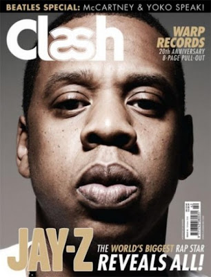
Here is the Jay-z on te front cover of clash magazine that I was refereing to before. one thing that I can say is a positive of the front page is that there text all matches and is easy to see, but nonetheless I just think there is too little of it for a reader outside the target audience for them to be able to pick up this magazine and read the front page and be able to gather what the rest of the magazine will contain. This then forces the consumer to look at the contents page for futher information. But what if the costumer doesnt want to look at the contents page? But still there is a good mode of adress on the front cover where it says " warp records 20th anniversary" here the magazine is advertising music related content and the target audience is sure to react positively to this as they will be able to identify with this.
In my front page mock up that I started to draw in school the first thing I did was make sure I included media conventions. Like mask heads and even bar-codes. These little details are important because It shows the intended reader of my magazine that its professional. However I really struggled with the mock up of my front page because I did't really know how I wanted to present it. For instance the choice of shot is awfully important in determining what the magazine will look like. For example we looked at an example of a R and B magazine that had Jay Z on the front cover with an close up shot in which Jay z engulfed most of the page. With such an overbearing use of the camera techniques I reacted negatively to it because there wasn't really enough room to include other information on what other articles the magazine would included. However I did understand that not is the target audience of that magazine likely to already be associated with the themes of the magazine, and also that Jay z is one of the biggest R and B artists in the world and so the magazine is sure to sell copies just because of his status.

Here is the Jay-z on te front cover of clash magazine that I was refereing to before. one thing that I can say is a positive of the front page is that there text all matches and is easy to see, but nonetheless I just think there is too little of it for a reader outside the target audience for them to be able to pick up this magazine and read the front page and be able to gather what the rest of the magazine will contain. This then forces the consumer to look at the contents page for futher information. But what if the costumer doesnt want to look at the contents page? But still there is a good mode of adress on the front cover where it says " warp records 20th anniversary" here the magazine is advertising music related content and the target audience is sure to react positively to this as they will be able to identify with this.
Tuesday, 2 November 2010
Analysing different types of magazines
In media studies class today we looked at magazine front covers and how they are displayed and we also look at how magazine design double page spreads. Firstly what I find out with the layout with this front cover conforms with the normal conventions you would associate with a magazine. For example the title is the biggest text on the page and it stands out and is identifiable. Then you notice that the rest of the text is smaller, this text is where you are likely to find information on what articles you are going to see in the magazine, and also the colours of black, white, and yellow is used repetitively which shows the designers have thought about what they are doing. Then of course there is a picture of a famous celebrity and in this case Justin Timber-lake. This will likely attract people who like music. This is interesting because CQ magazines is not a conventional music magazine and focuses more on celebrities. Also because there is so much info, it will be able to attract a whole range of people like those who like reading celebrity mags, or those who like music etc etc.
Now look at this image on the cover of empire magazine. I have used this as an example because in media class today at a music magazine that had Jay z in the cover but used a close up shot and included little information on what the magazine contained. That was an example of a magazine not being conventional. Here Empire magazine have actor Marlon Brando on the cover, with essentially no other text apart from the title which is in gold. However it has to be said that the simplicity of it makes it stand out from the crowd. However with a cover like this you would assume that film lovers are likely to buy this magazine, as a cover like this is unlikely to attract say someone who is interested in rock.
Monday, 1 November 2010
Final contents page

Here is an example of my final contents page. The first thing you will notice is the colour combinations. Red and blue which I also used for my front cover remain. I have done this in order to show that I have look at conventions of other magazines where there contents pages colour scheme matches there front covers. I included for pictures from different areas around the school like art and French. I have done this because I think it would attract my target audience because it will show them that this magazine is likely to have something for everyone. So basically it prevents my magazine from being to stereotypical like other magazines that are very specialist like vibe magazine. In hindsight I think I would of tried to make the images bigger however I did struggle with a couple of aspects of photo-shop. Also I think it would of been better If I had arranged the images in a more funky fashion as it looks a bit too plain. Nonetheless simple things like the type of text I used is also similar to my front cover and I hope to do something similar with my main task.
Subscribe to:
Comments (Atom)


