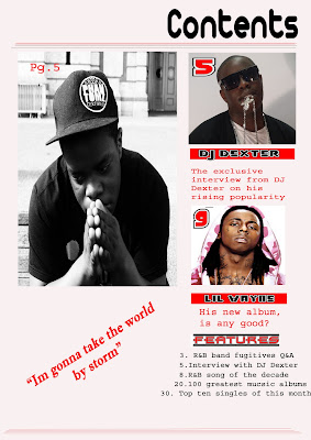
Here is the first draft for my front cover, and as you can see its still a work in progress and it does seem a bit empty without a lot of content. I tried to make the layout very simple in order for it not to look to cluttered. I have put one of the images in black and white intentionality because I feel that when my reader see's it he will realise that the tone of the article might be serious. I have then put the other images in there real colour which indicates that those articles might not be as in depth, and also it might mean its more light hearted. I have added features on the bottom to make it more conventional as in music magazines they often include features that show the reader what things that that magazine will contain that is special to that particular magazine.
I tried to make my mode of address appropriate for example it says " his new album, is it any good". I've done this to entice my reader as it will make them want to see whether or not Lil Wayne's album is actually any good. For some improvements I will add more pictures. Also I will try to add a competition advert somewhere. Then where the quotation is of my main article I intend to put it onto the actual image. And finally I want to alter the layout to make it look, well...better.
No comments:
Post a Comment