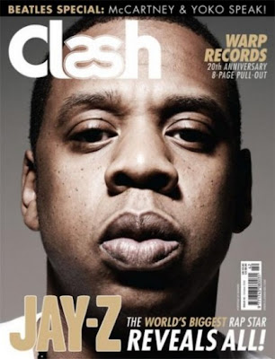
In my front page mock up that I started to draw in school the first thing I did was make sure I included media conventions. Like mask heads and even bar-codes. These little details are important because It shows the intended reader of my magazine that its professional. However I really struggled with the mock up of my front page because I did't really know how I wanted to present it. For instance the choice of shot is awfully important in determining what the magazine will look like. For example we looked at an example of a R and B magazine that had Jay Z on the front cover with an close up shot in which Jay z engulfed most of the page. With such an overbearing use of the camera techniques I reacted negatively to it because there wasn't really enough room to include other information on what other articles the magazine would included. However I did understand that not is the target audience of that magazine likely to already be associated with the themes of the magazine, and also that Jay z is one of the biggest R and B artists in the world and so the magazine is sure to sell copies just because of his status.

Here is the Jay-z on te front cover of clash magazine that I was refereing to before. one thing that I can say is a positive of the front page is that there text all matches and is easy to see, but nonetheless I just think there is too little of it for a reader outside the target audience for them to be able to pick up this magazine and read the front page and be able to gather what the rest of the magazine will contain. This then forces the consumer to look at the contents page for futher information. But what if the costumer doesnt want to look at the contents page? But still there is a good mode of adress on the front cover where it says " warp records 20th anniversary" here the magazine is advertising music related content and the target audience is sure to react positively to this as they will be able to identify with this.
No comments:
Post a Comment