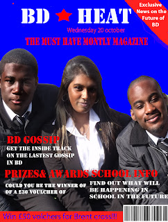
Another thing I would like to point is that I think that my decision to use a mid shot instead of a close up was vindicated because with a close up shot I think it would of looked to distracting. But also I mid-shot shows our school's uniform, which shows that our school is very professionally when compared to other sixth form's who do not where uniform.
Saturday, 30 October 2010
Final draft
Another thing I would like to point is that I think that my decision to use a mid shot instead of a close up was vindicated because with a close up shot I think it would of looked to distracting. But also I mid-shot shows our school's uniform, which shows that our school is very professionally when compared to other sixth form's who do not where uniform.
Thursday, 28 October 2010
Personal learning
During the process of creating some of the drafts for my front cover and my contents page I have started to become a little bit familiar with how to use phottoshop. At first I struggled immensely but luckily during class my teacher gave us a couple of simple territorials.
Here is an example of a website that our teacher gave us that we could use :http://www.pegaweb.com/tutorials/beginners-guide-adobe-photoshop/4-blending-options-special-effects.htm
This website shows our class how to do some of the simple things that you can do with photoshop. For example I learnt how to change to colouring of a image to make images look darker, I did this when I had a image that was to bright because of the sun. You can see this in the second draft of my magazine front cover as the colour of the students is noticebly darker and iroinically this actually makes the image stand out more. I also learnt one of the most important yet basic things to need to know about photoshop and this is about the use of laeyrs. This allows you to add things like colourful backgrounds without having to over complicate things and it helps you edit things a bit more easily.
Another thing that I learnt during the process of making another draft of my front cover is how to make my front cover more professional. My teacher adviced me to change the font of my title so that it would be in sink with the other font that I had used. As otherwise it did't match at all. I tried t aruge with me teacher as I said that it made it look unique, however once I refelcted and changed it I realised it made the front cover look extremely professional.
Wednesday, 27 October 2010
Audience
Whilst working on my magazine I wanted to look at the my target audience and wanted to evaluate whether or not I had not only represented them well but also if I had done well to involve them in the process of creating the front cover of my magazine. Firstly people in my sixth form of course have a whole different range of likes and dislikes, for instance people like rock music some like R and B or some people like more creative subjects like art or more "academic" like ICT and so on. I had to make a decision on should the layout of the front cover address there interests. I decided not to as this would stereotype the magazine, and although stereotypes are hugely popular in media, I thought that my magazine should be a reflection on everyone in the sixth form not just a particular group. So for example if you look at the draft for my front cover you notice the lay out if slightly formal and serious, no funky text and its very organised.
Another thing I had to think about is that If I were to create an actual magazine the magazine would likely adapt in time in tune with the people who are likely to buy it. Bot of course this is just my theory. But I did make sure was that a range of interests were put on the magazine, so all I did was for example in the contents page I put a picture of students in a ICT class to show the reader that the magazine would reflect there interests but then I included pictures of a art lesson, which once again rein-firms that fact this magazine inst biased towards a particular subject or interest. Another thing to add is that the colours used was also not reflected for instance the magazines primary colours of blue, white, and red was unbiased because it were colours that everyone was familiar with as it was the colours that the school is associated with. So maybe I might have gone about this the wrong way because I never asked the people in sixth form what colours they would like, as I'm sure male and female students opinions on this would differ, therefore It could be seen a neglecting my target audience.
Another thing I had to think about is that If I were to create an actual magazine the magazine would likely adapt in time in tune with the people who are likely to buy it. Bot of course this is just my theory. But I did make sure was that a range of interests were put on the magazine, so all I did was for example in the contents page I put a picture of students in a ICT class to show the reader that the magazine would reflect there interests but then I included pictures of a art lesson, which once again rein-firms that fact this magazine inst biased towards a particular subject or interest. Another thing to add is that the colours used was also not reflected for instance the magazines primary colours of blue, white, and red was unbiased because it were colours that everyone was familiar with as it was the colours that the school is associated with. So maybe I might have gone about this the wrong way because I never asked the people in sixth form what colours they would like, as I'm sure male and female students opinions on this would differ, therefore It could be seen a neglecting my target audience.
Thursday, 21 October 2010
Mode's of address and media conventions
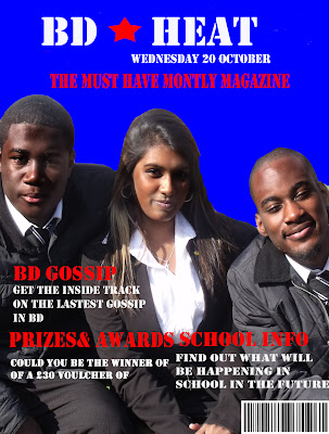
In my latest media lesson we learnt about the way in which the media addresses people. A primary example of newspaers that do this is the daily mail, and the sun. In titles they address the reader usually as if they are talking directly to them. For instance if you look at an article about Wayne rooney leaving Manchester United it says " I am to good for united" on the title. Even though if you read the rest of the article Rooney doesn't even say those things. So the newspaper fabricate things as they know that there target audience will also agree with these staetments. Now if you look at the sun, almost all there titles they use slang to hunerous there articles. And most of there articles are biased in the way that they report things. In broadsheets like the guardian or the independent these newspapers are more serious and unbiased. This is becuase there target audience are considered more intellectual. Therefore the quailty of the articles will be very high.
Also in this lesson I discussed with my teacher on how to improve my front cover. He suggested that my front cover did not have some of the conventions the magazines usually have. Simple things like not having a barcode. So i put this in. Also the font i used for my title before did not match with the rest of the text on the cover. So he suggested that the title's font should match with the smaller text. When I looked at my front cover and how I adress the audience I think I've done this already. For example on my front cover in red it says " the must have montly magazine". This tagline is slightly serious which is appropriate because the sixth form school i am representing is also serious for example students in the school where uniform, and teachers in he school treat them just like they would in lower school. Also the font is straight and moody, which is a perfect representation of the seriousness of BD sixth form. One way of me using representation is that my front cover is very orginised, and it not choatic or messy. The symbolic conventions like the colour schemes is important for setting the scence of what the magazine is going to involve.
Wednesday, 20 October 2010
The gratification theory
The gratification theory is described as a way of understanding mass communication. So this basically means the theory revolves around how people use media in there every day lives. Its how we use media, rather than what media does to us. So for example when we find out some interesting news for instance when we find out football results or when we watch a good episode of a good television show we often go to our friends and discuss these issues, and this is a way of socialising. This is one of the main things people use media for, a way of initiating social interaction.
Also the gratification theory promotes a sense of belonging . So I decided to see if my magazine cover does this. The second draft of my magazine cover has a image of 3 students smiling. This promotes a sense of belonging because the the picture is very inventing and creates a friendly atmosphere. Another intresting thing I discovered about the gratification theory is that people use media to fulfil there particular needs. So for example people who are interested in rap music will often listen to choice fm via the radio or Internet. This is something I want to put into my magazine, for instance on the front cover i could advertise music.
The next question I posed was what entertainment my magazine has to offer. In my magazine I will have a advertisements of competitions, I have already included this but it doesn't stand out enough because I put with the rest of the text in yellow, this means its hard to read.
What information was provided about my school's courses?
This is another thing that isn't on my front cover, there isn't really information on what kind of courses my school offers. So its quite ambiguous in that department.
Tuesday, 19 October 2010
2nd magazine front cover draft
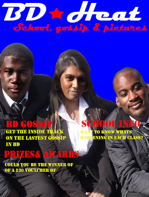
Here is my second magazine front cover draft. Firstly one significance change is the colour in the background. I did this because the previous background which was part of the school building was too distracting and I thought that it was not very appealing. So instead I filled the background in blue. Subsequently what this has done is that now the title stands out more for example the white colour used when it says "BD heat".
Secondly I changed the lighting. As because I took a picture outside the common room the sun made the image to bright. So I decided to use the burn tool on photo-shop. This meant that I could darken the students in the picture, so I basically made the lighting more appropriate for the front cover of magazine. However I did fail to implement some typical conventions to the magazine. Like for example i did't put a bar code which is of course on all magazines. But also I could little banners for competions etc, all these things make my magazine look that bit more professional and ultimately more appealing to my target audience. For my next draft I want to add a bit more fun and variety on front cover, just little details that I'm lacking at the moment that make my front cover look more professional.
Look at this magazine cover of a monthly addition of "empire magazine". Firstly there is the most predominant image of the 3 movie stars Matt Damon, George Clooney, and Brad Pitt that the main image. This is just like my magazine where I have 3 students on the front cover. But interestingly at the bottom they have in a black box 3 images of other movie related pictures. That's what I want to add to the next draft of my work. Today I took pictures in art class, as I already have other pictures ready to use, so I my next draft I will hopefully try to put the pictures near the bottom of my magazine cover. The advantage of this is that i gives my target audience a little taster of what else the magazine has to offer, as well it shows that the magazine has variety. When look on the internet having multiple images near the bottom of the front cover is one of the typical media conventions used so I'm interested in what the end result will look like it I can implement it successfully.
Reprensentations and research
For research I decided to think of how my magazine represents the social groups within my school. In my school there are people from many different social backgrounds. Whether your from africa, asia, europe etc. I would like my magazine to repressent of these ethnic backgrounds and not alienate anyone. That is not to say that my front page has to be muliticultral, as I want my front page to be something that I think would attract people's attention. However I want my contents page to involve having pictures from many different areas of the school eg art, science, and even pictures of what people do in the sixth form common room.
Then for futher research I decided to have a survey on what people would expect ot be on the front cover of the school magazine. There was 5 options for pictures:
Pictures in a science class
Picture in an art class
Picture in the common room
Picture of students doing an activity
Other
Firstly I had 5 options because if there were many options then the would be no clear winning, and therefore I would gather no informtation. $ of the options were the pcitures I was intrested in using. I chose up to 20 students, 10 from upper sixth form, and then another 10 from lower sixth form. I done this becuase it would of been a fair representation of what sixth form studdents thing, and it would alow me to gather an consensus. Here are the results.
Pictures in a science class- 6
Picture in an art class-4
Picture in the common room-8
Picture of students doing an activity-2
Other-0
Total number of votes 20
Analysis of results
What the results show me is that people from sixth form wanted pictures from the common whether outside or inside to be on the front cover the most. This tells me that people in sixth form want the magazine to reflect on what they do when they are soccialising outside class. Luckily enough the first draft of my magazine already has a pictures of students sitting outside in the sixth form playground. The second most popular thing that students wanted to have on the magazine was oictures take from science class. If I were to use an image from science class I hope to represent science as intresting and fun. This is important becuase I want school to come across as enjoyable, otherwise my target audience will not be at all intrested in reading my magazine. It will also be going against teenage stereotype, in which people expect teenagers to look thugish.
Saturday, 16 October 2010
Connotations and denotations
In my most recent media studies lesson we learnt about connotations and denotations. We also learnt how the front cover of our magazine will always involve these two things and that it's important to implement them.
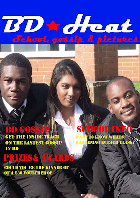
First lets look at denotations. A denotation is the first level of meaning of an image for example when you look at a picture of a rose it represents and flower and reminds the person of the real thing. So if you look at the first draft of my magazine cover you see 3 students wearing uniform outside the sixth form common room. You can also see that 2 of them them are from a African or Caribbean background, and the one in the middle originates from Asia.
Now lets look at connotations. Connotations is a meaning associated to an image that is beyond the obvious. As you can tell the students in the picture are from an ethnic background. So the reader of the magazine will then be able to infer that the school is extremely multi-cultural and very diverse. The reader of the magazine will also have connotations that people from different backgrounds are able to mix.
For research I decided to look up a real life example of a connotation so that I understand fully why it's used and whether I should also use it.
Here's a primary example of connotations used in a film poster. Here's an image of the iconic godfather film poster and in the picture you see Marlon Brando wearing a red rose. The rose has connotations of death, murder and blood, whereas you would usually associate a rose with love. The movie makers have clearly put emphases on the rose because the rest of the poster is in black and white, which makes the red of the rose increases in prominence and it stands out
Looking back at my first draft of my magazine cover I'm glad that I have already used connotations by representing the cultural diversity of my school. As previously stated becuase I used people of different backgrounds.
Wednesday, 13 October 2010
Tuesday, 12 October 2010
Questionaire
In this blog I decided to create a questionnaire that people in 6th form could fill in because I wanted to find out what they think I should include on the front cover of my magazine. And also It would give me a chance to hear what other people think of the first draft of my magazine cover.
Name
What is your age?
15-16 16-18
What are your favourite lessons?
English Maths Science Art Geography Other
What are your hobbies?
What would you like to be included on the front cover of the magazine?
Competitions General info Pictures Gossip School curriculum Other
What colours do you want the title on the front cover to have?
Blue Red White Other
What did you like about my first draft of my front cover
What improvements do you think I should make to the first draft of my magazine cover?
------------------------------
I asked up to 10 students who were all in my 6th form. Although this was biased because people from the other year groups did not participate, I wanted to know what my target audience thought, and that was my main concern. Also I asked simplistic questions and kept it short so that people would want to fill it in otherwise if it was too long they might not want to participate, I know I wouldn't! In my next blog I will attempt to scan a draft of someone who completed my questionnaire.
What did I learn?
Well surprisingly when it came to what people wanted on the front cover of my magazine everyone wanted to have competitions on the front. This was good for me to find out because I had already included it on my first draft this shows that my initial ideas were in line with my target audience. .Other things that people wanted on the front cover was information on the school curriculum, this would include things like what knew and exciting things lessons will involve. I had thought to put this in at first, but I honestly thought this would make the magazine seem boring.
Also some of the questions I asked like for example "what are your favourite subjects" has been used to find out what subjects people like most and if people like one subject in particular I would include it somewhere on my contents page. And the subject that came out on top was art which received 7 votes out of ten.
First draft

Before I did a questionaire which would ask what would students ideally want on the cover of my magazine I created a first draft. First for the title I used colours that are synomnomus with the school blue and white.
For the sub headings I used red becuase red was also used in my title and also becuase it was easy to read. However I did have some problems with the the text below the sub headings, initially I wanted to use blue however it was difficult to read the handwriting. So I experimented with numerous colours until I settled on yellow.
The picture in the background I took was of students in the 6 form garden. I used this picture because I thought it would look more fun and enjoyable than having a picture of students working in a classroom on the front of the magazine as this would look boring and would not attract my target audience due to it being too
unamaganative.
However seeing as its my first draft there are still some improvements I could make. Maybe I should change the lighting slightly because it does seem to bright. Also it does look slightly boring. So this encouraged me to start thinking about how to jazz it up a bit.
Thursday, 7 October 2010
Media studies blog
In today's lesson our media teacher requested us to look at examples of magazines and then to answer a series of questions that are related to it. These questions range from what its target audience is, and also there is more in depth questions to do with the inteneded reader of the magazine, for instance What kind of breakfast would the reader eat who reads a magazine like classic rock..
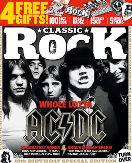
Here are just a list of some of the questions and answers we used to investigate the readers of the magazine:
What car or transport do they use? - a cheap car
What music do they like?- Rock
What is thier favorite meal?- takeaways
Do they vote and if so who for?- No one becuase the readers of this magazine are unlikely to be intrested in politics.
What I learnt hear is that the front cover should be a representation of what my targer audience stand for. It should show what intrests them. So that when someone who is not part of my intended target audience looks at my magazine they will know what kind of people would be likely to read it. Just look at the cover of this classic rock magazine the celebrities are look directly at the reader in an agressive way, but yet they loook relaxed, as if they do not have a car in the world.
This is good research becuase for my magazine cover I will have a picture on the front which will be representative to a teengae audience..
Wednesday, 6 October 2010
School lesson
In yesterday's lesson we learned about there various forms of representation.
Firstly we learnt about represetation. This means how media represents people like individuals, groups and events.
Then we learnt about media institutions and how they use a range of sterotypes and this is used as a visual shortcut. These steroetypes are used repeatedly and as a result people become accustomed to them. So consequently when you watch televisions or movies it becomes second nature to people and we make assumptions.
And then we learnt about:
Archetypes- the ultimate stereotype.
countertype- the opposite of stereotype and archetype
Also representations can change over time. What I learnt about in this lesson is that the front page has to represent well my target audience, so I want my front page not to be too stereotypical.
Tuesday, 5 October 2010
Researching film posters
In this blog I will be examining a movie poster that is aimed at teenagers. The movie poster that I am going to use is kidulthood. This is becuase its a movie I have watched and is popular amongst my friends and people of my age group.

Here the teenagers are represented in primarily a negative way. For example there is a image of a black youth holding a baseball bat and wearing a hoodie. This is very stereotypical of black urban areas. Also all of the characters are looking at the camera menacingly as if they are angry or being agressive. This is another stereotype of teengagers in the UK as most people percieve them to act and behave this way. I think this has been used to attract a teenage audience becuase maybe they can relate to the teenagers in the poster.
The layout and design of the poster is also intresting. There is dark clouds in the background ellude to the fact that the movie is dark and serious.
Slogans are used in the main title, as it says " before adulthood come kidulthood" stands out to teenagers becuase this really shows that this movie is made for teenagers.
The second movie I am using is high scool musical.

Here the image of the teenagers is happier than kidulthood . The teenagers are represented well becuase you can tell that they are in school, and they look academic and its as if they enjoy being there.
The colours use are vibrant and striking so this will attract a teengae audience mainly girls. Unlike kidulthood which used darker more neutral colours that it could appeal to a broader teenage audience. Another thing about the layout is that the posters looks like sometinhg you would see at school.

The last movie I will be analysing is bend it like beckham. Here the teenagers are presented as fun and as if they enjoy themselves. However the poster uses a stereotype in the layout because the main characters is asian and in the background you see olderly members of her family looking at her as if to say "what is she doing". This makes the poster seem humourous. Here you can see that the poster is trying to attract a teenage audince aswell as a asian one becuase it shows images of people from an asian background.
The movie has a tagline " who wants to cook aboo gobi". This is a humerous tagline which emphasises the fact that the movie is likely to be a comedy.

Here the teenagers are represented in primarily a negative way. For example there is a image of a black youth holding a baseball bat and wearing a hoodie. This is very stereotypical of black urban areas. Also all of the characters are looking at the camera menacingly as if they are angry or being agressive. This is another stereotype of teengagers in the UK as most people percieve them to act and behave this way. I think this has been used to attract a teenage audience becuase maybe they can relate to the teenagers in the poster.
The layout and design of the poster is also intresting. There is dark clouds in the background ellude to the fact that the movie is dark and serious.
Slogans are used in the main title, as it says " before adulthood come kidulthood" stands out to teenagers becuase this really shows that this movie is made for teenagers.
The second movie I am using is high scool musical.

Here the image of the teenagers is happier than kidulthood . The teenagers are represented well becuase you can tell that they are in school, and they look academic and its as if they enjoy being there.
The colours use are vibrant and striking so this will attract a teengae audience mainly girls. Unlike kidulthood which used darker more neutral colours that it could appeal to a broader teenage audience. Another thing about the layout is that the posters looks like sometinhg you would see at school.

The last movie I will be analysing is bend it like beckham. Here the teenagers are presented as fun and as if they enjoy themselves. However the poster uses a stereotype in the layout because the main characters is asian and in the background you see olderly members of her family looking at her as if to say "what is she doing". This makes the poster seem humourous. Here you can see that the poster is trying to attract a teenage audince aswell as a asian one becuase it shows images of people from an asian background.
The movie has a tagline " who wants to cook aboo gobi". This is a humerous tagline which emphasises the fact that the movie is likely to be a comedy.
Monday, 4 October 2010
Title
Here is an image that I want to use as the title for my poster. It has the name that won the most votes from my peers, as it had 16 votes double the amount of the title that came second. The title has a blue background, and then has white and red handwriting. I have used these 3 colours because they stand out and also becuase 2 of the primary colours of my school are blue and white, so the students will be easily associated to it.
I will use this at the top of the cover of my magazine. I want the rest of the front of my magazine to simply be an image of a student doing something ordianry like writing in a book, or doing experiments in a science class, this is becuase it will be similar to the collegue magazine that I looked at in my previous blog becuase I like the simplicity of it. But of course its important to remember that this is just a template and when I finally create an image of what my magazine will look like this title might not blend in well. Hopefully by the time I write my next blog I will start to take the pictures that I want for my magazine.
Friday, 1 October 2010
College
After taking some advice from my media teachers I decided to do some more research, but this time instead of looking at real life, mainstream magazines I looked at school and college magazines. This would be good becuase it will provide an insight at what my work should ideally look like. 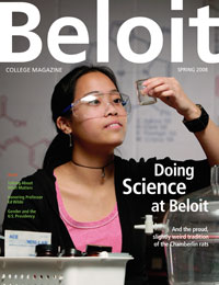
Whats intresting to see here is the simplicicty of it. It just has a picture of a student in a science room doing experienments. There's nothing fancy about it but it's simple and effective, and it does stand out,surprisingly. Secondly the most obvious thing the title is bold and white and stands out, also the rest of the sub headings are also in white. One criticism is that some of the text is in green, which makes it hard to read but becuase the rest of it is soo good its hard to notice. What I can take from this is that instead of making my magazine to bright and colourful, all I could do is get an image of someone in the school doing something posistive and intresting. Maybe simpicity is more exciing than you would expect.
After taking this in, I showed this image to people in my sixth and asked them what they liked about it. One person said" its looks intresting, and you can tell its a school magazine and that makes it attractive". Another person said " you can tell its a school magazine, but maybe it should be more colourfull". Two completly contrastnig perspectives, but one thing they both agreed on was that it was easily identifyable as a school magazine.
Subscribe to:
Comments (Atom)
