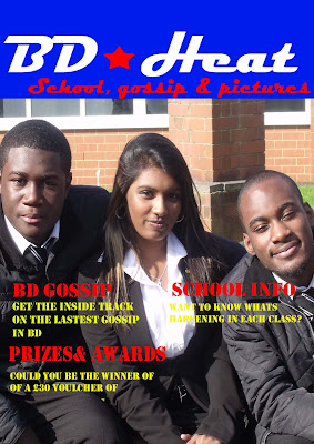
Before I did a questionaire which would ask what would students ideally want on the cover of my magazine I created a first draft. First for the title I used colours that are synomnomus with the school blue and white.
For the sub headings I used red becuase red was also used in my title and also becuase it was easy to read. However I did have some problems with the the text below the sub headings, initially I wanted to use blue however it was difficult to read the handwriting. So I experimented with numerous colours until I settled on yellow.
The picture in the background I took was of students in the 6 form garden. I used this picture because I thought it would look more fun and enjoyable than having a picture of students working in a classroom on the front of the magazine as this would look boring and would not attract my target audience due to it being too
unamaganative.
However seeing as its my first draft there are still some improvements I could make. Maybe I should change the lighting slightly because it does seem to bright. Also it does look slightly boring. So this encouraged me to start thinking about how to jazz it up a bit.
No comments:
Post a Comment