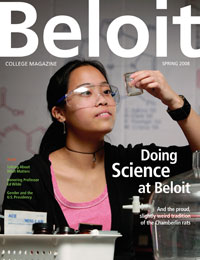
Whats intresting to see here is the simplicicty of it. It just has a picture of a student in a science room doing experienments. There's nothing fancy about it but it's simple and effective, and it does stand out,surprisingly. Secondly the most obvious thing the title is bold and white and stands out, also the rest of the sub headings are also in white. One criticism is that some of the text is in green, which makes it hard to read but becuase the rest of it is soo good its hard to notice. What I can take from this is that instead of making my magazine to bright and colourful, all I could do is get an image of someone in the school doing something posistive and intresting. Maybe simpicity is more exciing than you would expect.
After taking this in, I showed this image to people in my sixth and asked them what they liked about it. One person said" its looks intresting, and you can tell its a school magazine and that makes it attractive". Another person said " you can tell its a school magazine, but maybe it should be more colourfull". Two completly contrastnig perspectives, but one thing they both agreed on was that it was easily identifyable as a school magazine.
No comments:
Post a Comment