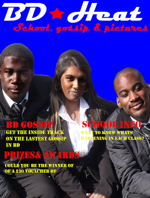
Here is my second magazine front cover draft. Firstly one significance change is the colour in the background. I did this because the previous background which was part of the school building was too distracting and I thought that it was not very appealing. So instead I filled the background in blue. Subsequently what this has done is that now the title stands out more for example the white colour used when it says "BD heat".
Secondly I changed the lighting. As because I took a picture outside the common room the sun made the image to bright. So I decided to use the burn tool on photo-shop. This meant that I could darken the students in the picture, so I basically made the lighting more appropriate for the front cover of magazine. However I did fail to implement some typical conventions to the magazine. Like for example i did't put a bar code which is of course on all magazines. But also I could little banners for competions etc, all these things make my magazine look that bit more professional and ultimately more appealing to my target audience. For my next draft I want to add a bit more fun and variety on front cover, just little details that I'm lacking at the moment that make my front cover look more professional.
Look at this magazine cover of a monthly addition of "empire magazine". Firstly there is the most predominant image of the 3 movie stars Matt Damon, George Clooney, and Brad Pitt that the main image. This is just like my magazine where I have 3 students on the front cover. But interestingly at the bottom they have in a black box 3 images of other movie related pictures. That's what I want to add to the next draft of my work. Today I took pictures in art class, as I already have other pictures ready to use, so I my next draft I will hopefully try to put the pictures near the bottom of my magazine cover. The advantage of this is that i gives my target audience a little taster of what else the magazine has to offer, as well it shows that the magazine has variety. When look on the internet having multiple images near the bottom of the front cover is one of the typical media conventions used so I'm interested in what the end result will look like it I can implement it successfully.
No comments:
Post a Comment